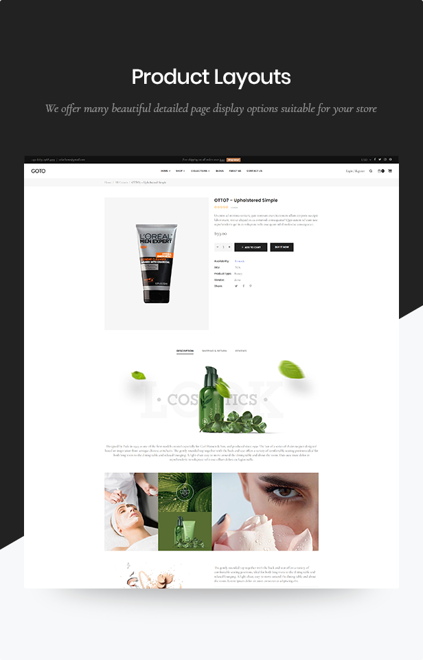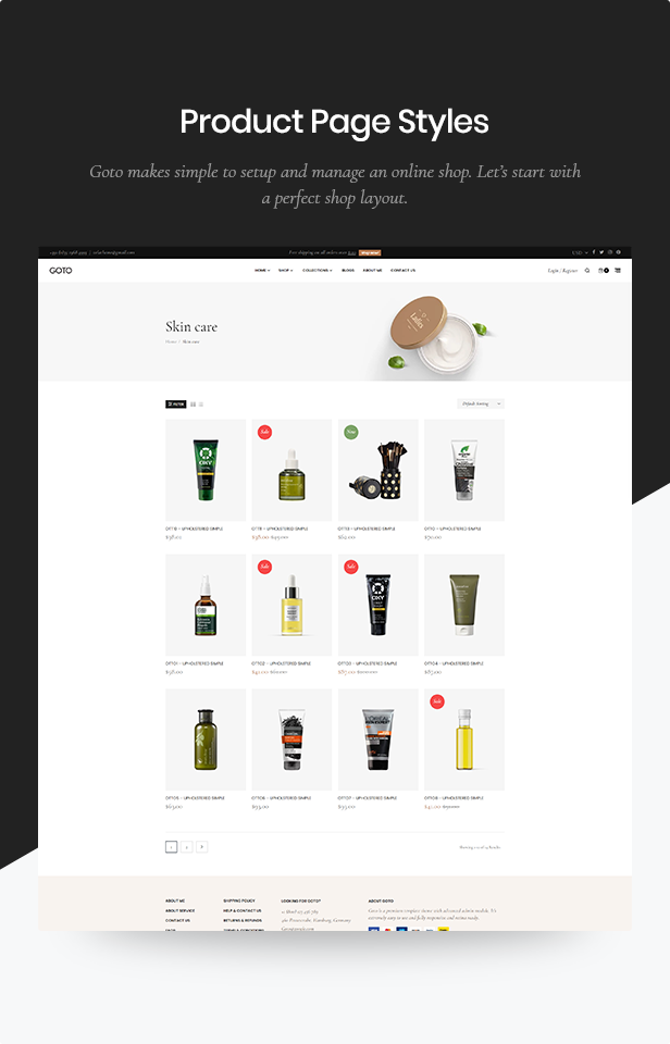


GoTo – Responsive Shopify Theme is a special theme. First of all, GoTo perfectly and beautifully mix and match colors, banners, blocks… to give the whole layout a gorgeous look. GoTo has a large banner for you to showcase your hottest and newest products to immediately catch your customers’ hearts. Information blocks are nicely and neatly display for your customers to easily find the information they need.
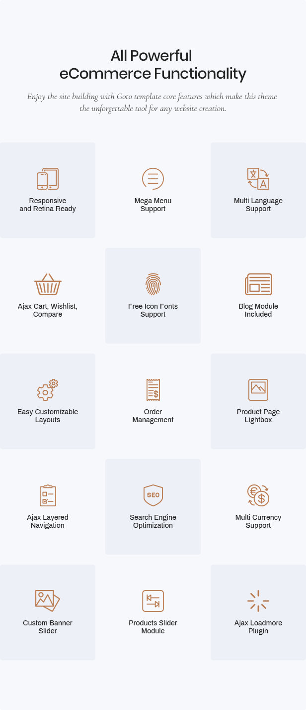
Second, we bring you a special module to display all categories which is Shopify Advanced Mega Menu Module. This module will help your customers find their wanted items at their first impression on the website. What’s more is you can easily manage and update all information from the Admin backend for Shopify Admin Panel. Beside, we also provide the new Ajax Layered Navigation. The Ajax Layered Navigation is an improvement of the use of Tag in order to filter your products regarding colour, size, brand or price; and these tags can operate simultaneously. Thanks to this special feature, your customers will find out their best fit at a glance. Hence, your conversion rate will be improved.
Third, GoTo, just like other Responsive Shopify Templates we have introduced you, GoTo is designed with large Responsive Web Design (RWD), therefore the website can be display perfectly in all devices, such as: destop, iPhone, iPad, Smartphone Android, Tablet Android…This will give your store a consistent look in no matter which devices the customers are using. Also, they can shop at your online store anytime,
Real websites created with our theme:
https://hardshell.co.uk
https://divva.co


FULL FEATURED LIST
- Well Documented
- Powerful admin control panel
- Amazing Slider built-in
- Unlimited Color Options
- Easy customizer section
- 100% fully Responsive with Twitter Bootstrap 3
- CSS3 & Sass CSS
- Font awesome icons integrated
- Elegan Font icon integrated
- Advanced Typography Options
- Google Web Fonts Integration
- Drag and drop
- Mega Menu
- Off Canvas Menus mobile
- Video Background Section
- Background Parallax Section
- Ajax Add to Cart
- Ajax Paging & Ajax Toolbar built-in
- Newsletter Popup
- Product Carousel
- Product Sale Label
- Grid & List Mode
- Quick View built-in
- Lazy loading
- Customer Reviews
- Brand Logo Slider
- Blog Post Slider built-in
- Social networking
- Prefined Style Page; Contact Page, Typography, FAQs
- SEO optimized : Speed, Google?s Rich Snippet, heading, title?
- Google Mobile Friendly
- Browser comparison
- And Much More! Check out the various demos!
SUPPORT CHANNELS:
- Send us a ticket for https://velatheme.ticksy.com/
- Email Support: [email protected]
Change log:
Up new version 2.0 (13 September 2022)
Add New(20 May 2021)


